Thursday 29 May 2014

Pause for Thought

Even though I know it is important to keep working on my theme and constantly tweaking and pushing it, I sometimes get a bit 'stuck'Although I have useful tutorials,  it is hard not having other students on my course to share work and ideas with. I got a bit stuck recently so I decided to clear my mind and do something a bit different. As I am constantly focusing hard on the selection, significance, arrangement, look, contrast, colour of collections of small objects, I thought I would blur my focus to give my eyes a rest. I made a pinhole camera by taking the lens off and sticking over some tape with a tiny pinprick in it.
I then walked around the campus snapping architectural features and sky. It was lovely to be doing something more free and open.


Looking at these and many others I took, gave me a sense of calm with the blurred edges, limited colours and soft focus. I then manipulated them in my usual way.


I know I can't seem to get away from mirroring everything, but I am pleased with these structural and simple images produced from an antique process manipulated with digital technology.
The eye still seems to travel up and down and across the lines of symmetry, but there is also  a sense of blurred, calming shapes that come in and out of focus. They remind me a bit of the intricate skeletons and exoskeletons of insects and sea creatures.

Wednesday 28 May 2014

Everybody is wearing it!

Kaleidoscope Clothing

You can see that my idea of creating kaleidoscopic images from sections is zeitgeist at the moment. Everyone is wearing it!


Images from Google search 'Kaleidoscope clothing'

This is why I have decided to try printing some of the mages onto silky material. I think the sheen of the fabric will add to the seductive draw of the image.

Jill Dixon


http://www.courtyardarts.org.uk/wp-content/uploads/2014/04/wondersofthemindgallery.

I recently saw this artist’s work at an exhibition in the Courtyard Arts in Hertford. The exhibition featured some of the graduating Creative Arts students from UH and Jill, who graduated last year.
I am supposed to keep abreast of current trends and cutting edge techniques in photography, so this exhibition and Jill’s work in particular was interesting. However, it is quite depressing when another artist’s work seems to be parallel to my own! In some ways, even her development followed similar paths to my own. But Jill uses a variety of media in her images including hand made paper, glass and fabrics. Her aim is to manipulate and layer images to produce new perceptions for the viewer. She creates 2 and 3 dimensional pieces.


                                   Dixon(2014) Origami Bright

It looks as if Jill has made a n 8 sided object here, whereas I make hexagons. Some of her sections are uneven and not symmetrical. It looks as if something organic is growing out of it and all the patterns seem to be from nature. The lack of symmetry would bug me! But yo can see the similarities with one of my recent hexagons.


I find it pleasing and soothing to see' everything as it should be' all the sections are arranged in an ordered and neat way, with the pattern they create repeating all the way round the hexagonal.
On closer inspection, you can see the image includes snails, tablets and cigarette ends.


My work is different in that although I use manipulation, I take one section of an image, which has been created from a plate of objects that all have symbolic or literal meaning to me. My message is about how I try to control and subdue the irritants in my life: How I want to make order from chaos by making beauty and symmetry from disgust and organic disorder. I want to lure the viewer in with a seductive, colourful detailed display, then shock them with the unsettling objects within that image.

                                                       Dixon, (2014)

here Jill has used a mirror image creating a symmetrical final piece. This is similar to my own technique, although Jill has used printed fabric in this piece, whereas I am just using digital imaging at the moment. I have, however booked to make some copies onto fabric in the 2D workshop.
You can see the similarity in our two images. Symmetrical, mirror, kaleidoscopic images are very popular in the creative industries at the moment.


Friday 23 May 2014

Unsettling Detail


My work is about control of negativity; shaping the symbolic representation of bad things in my life and representing them as seductive, attractive balanced images. Only on closer inspection does the viewer begin to unravel the patterns and see the bones, mould, and rot that make up the image. From feed back on social media, I have found that the images are 'too beautiful' Even when viewers know what the image is made up of, they are still not repulsed.


So now I am experimenting with using fewer repeats of the original image, so that the meat, blood and lock of hair, for example in this image, are more clearly visible. The globs of congealed blood and meat are thrown into contrast by the bright white of the delicate background. It is difficult for me to do this as I prefer the effect of the large intricate images and this experiment feels like a backward step, but I think it is important to include the sense of dis-symmetry and imbalance that are the natural result when I attempt to control unpredictable elements in my life.

The thick drops of blood, and stains on the cloth  are more obvious in this image, as are the marbled patterns on the meat. I think this is probably more effective. I am planning another shoot where I will use oil sprayed onto the surface which will give a more visceral feel to the image.


Monday 19 May 2014

Social Media Feedback

         
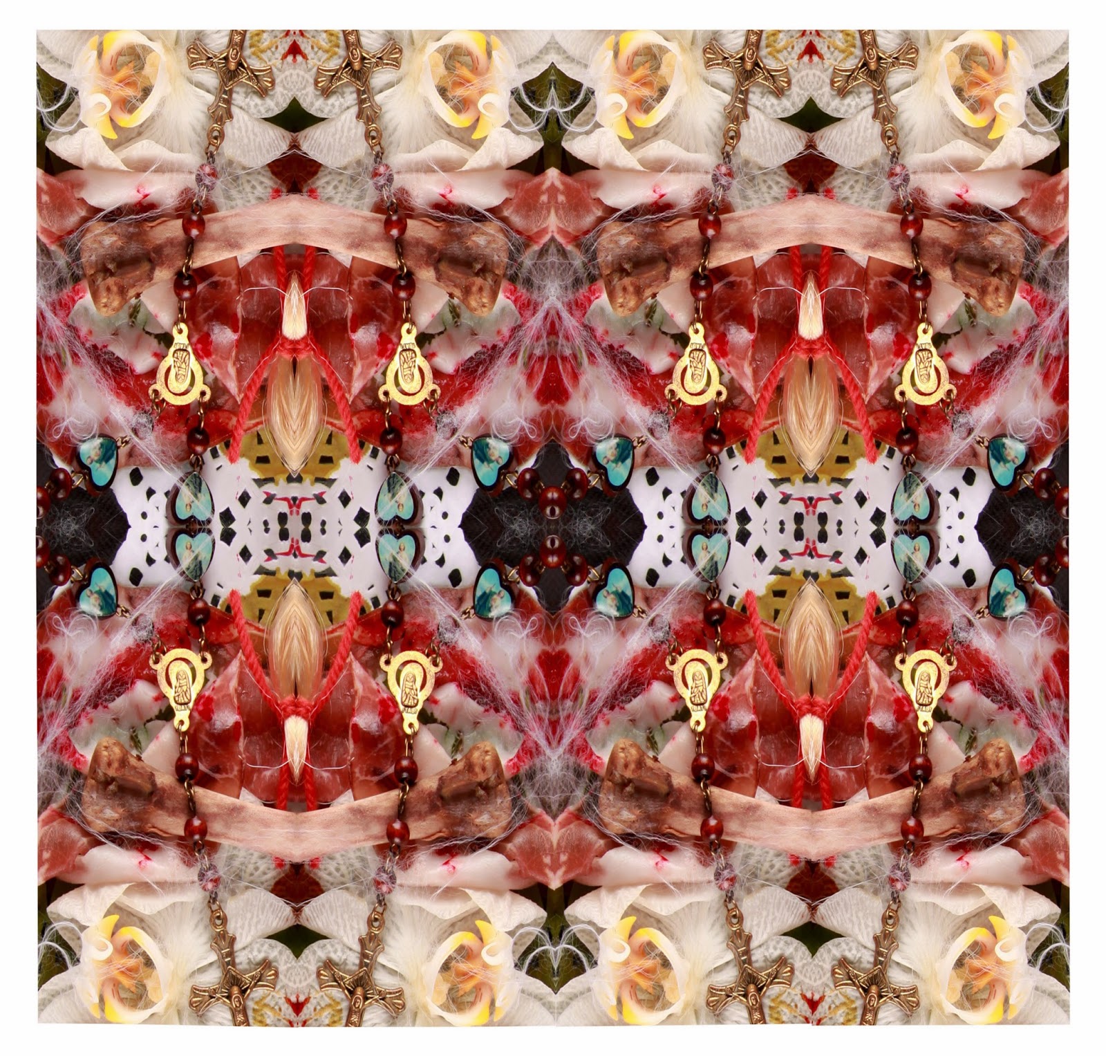
  I asked for comments on a couple of my "Blood and Guts images that I posted on Facebook. This one is made from bones, meat, blood, an orchid and a rosary.

Below are some of the comments:


             First reaction is delight at these sumptuous colours and shapes.I should need to have them much magnified to see the blood and guts if that is what they are made of. The top picture in particular seems to contain red and green jewels and four pendants with the face of a bearded 'patriarch'. If my eye can gather so much pleasure for me I am inclined to leave it there and enjoy what I think I am seeing.

            
            Then we come to the question - how would I react if I could get the images to enlarge (they won't on my screen) so I could see what is actually there I don't know. Am I being made a fool of? Do I mind?

        
           There is a church in Middelburg in the Netherlands much decorated with stone 'garlands' of bones and skulls - to remind the congregation of their coming death. They produce a double take, as I suppose these images would, but they can claim a moral purpose. These set out apparently to play with the viewer. The resulting image is so beautiful that I can forgive what is a kind of deception, aided by the willingness of the eye to make its own version of what it sees.


            Not much use as comments as I'm not getting the repulsion bit. Love the pictures             though!

As I thought, the images are not evoking the repulsion response, so I need to make the subject matter clearer.

Deutsche Borse Photography Prize


I went up to the Photographers Gallery and had to weave through huddles of exhausted shoppers eating their  MacDonald's and slurping diet Coke in the little alley leading to the Gallery.
(tpg.org.uk)

My Favourite exhibitor on the 5th Floor was Richard Mosse; partly for the images themselves, but also because of the risks he took to capture them!
Mosse's work can be considered to be at the forefront because he is using a traditional photographic tradition-The landscape photograph, but
 A) choosing a very different form of landscape (Battle sites)
 B) Using a new and unique technology in hie process (that of infra red film)

Mosse has produced a series of images documenting the landscape of the Eastern Democratic Republic of Congo, where 5.4 million people have died because of wars in this region since 1998.
I feel a connection to this landscape as one of my favourite books is 'The Poisonwood Bible' by Julia Kingsolver, which is set in the Congo before it gained Independence. The book created the sense of brooding, sweaty malevolence that is also reflected in Mosse's images.


                                            Mosse (2012) from 'The Enclave'


He used infrared Military film which was used to detect soldiers and bases hidden in the lush green foliage. The film turns everything that was green into shades of shocking pink and crimson which gives a  bright, garish carnival feel to the images in total contrast to their subject matter. They fill up your eyes with seductive technicolour and create the contradiction of attraction/repulsion that I am trying to create.
It is easy to allow the image to wash over you without thinking about the devastation and death some of the images portray.


                                       Mosse (2012) from 'The Enclave'


Although Mosse's work is an important  photographic documentation of a region devastated by war, there still exists the similarity of ugliness presented in a beautiful way. The oxymoronic 'beautiful decay' or 'delightful disgust ' that I am trying to create are present in these images.


Jochen Lempert
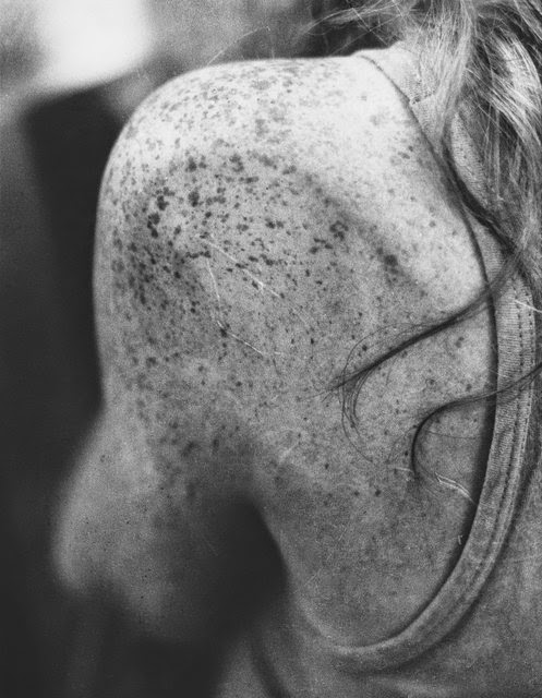
This photographer originally trained as a Biologist, which is evident in his careful observation of the human form. This image presents the freckled surface of skin on a bony shoulder. The shape of the bones is visible under the skin and fine airs are stuck on the surface. The fact that the focus is on a small part of a body, rather than a more obvious study or portrait give the feeling of intimacy and gentle connection. I like the idea of layers the this images presents; the freckles, the skin, the skeleton, the person. It makes me consider the ideas of layers and depth in my own work.


                                    Lempert 1993-2011 Untitled(Girl in telephone Booth)

Another New Artist


Emily Mowat has recently graduated from Nottingham Trent University. She is another artist who was selected for the 2014 Catlin Exhibition. Emily says her work ' exists as a commodity while chronicling artistic behaviour and its influence on popular culture'.

                                               Mowatt(2014) Bellini(After Cipriani)


There are echoes of Walter Benjamin and his views on the mass-produced piece of art. Also perhaps some reference to the Dadaist tradition of 'readymades' where an existing piece is given new life and meaning by being presented differently.
The first post in this Major Study blog was of some experiments I was doing with the construction of a 'Cabinet of Curiosities' The idea was to make little exhibits of each element or object I had used in the making of one of my multiple images. I have left this idea behind for a while, but still think it might work. It dissects the whole final piece into its tiny individual components, showing the physical 3D parts of a digital 2D piece.
  Mowat's piece is similar in the way it presents  physical objects, the peaches, in front of the flat print.
It does make you stop and rethink what you are looking at and what you are seeing.

Catlin Gallery

Catlin Art Prize  2014      www.artcatlin.com

I hunted out this amazing gallery in a little street in Shoreditch. Shabby on the outside, cool and luxurious on the inside!
It was a presentation of the best recent graduate and post graduate U.K artists.
I thought it was important to see what ‘cutting edge artists’ were up to.
Immediately, as I walked in, I was impressed by a large man in a suit at the door. I was a bit intimidated and expected him to ask me for my invitation, but he just handed me a beautiful blue book and a leaflet. What I thought was a book was in fact the beautifully textured deep blue sleeve of the ‘2014 Guide’ to the 40 artists inside. I felt like an expensive special edition record sleve.

As I walked into the exhibition space, I could feel how the setting, lighting, ceiling height- (very high) and textural finishes (Concrete, wax, velvet, retro wallpaper) all added a great deal to the experiencing of the art on display. The ‘Mise-en-scene’ had been carefully and intricately planned and created. The venue alone is an experience.


Neil Raitt

The winner this year is Neil Raitt whose work brings back memories of the ‘Sea House’ we rented as a family on the Isle of Sheppey. Although it was almost on a beach made up entirely of pink and orange shells with the muddy Medway beyond, the wallpaper was of alpine scenes! It always smelled damp too!

                                         Raitt (2014) Alpine 3


                                                                 Raitt (2014) Magic Tree 


Neil’s work is painted repetitions of mountain ranges, some with a lone pine tree, some with great forests of them. They become overwhelming in their repeated pattern. He has set them on a trellis-patterned wallpaper, which increases the layers of repeated pattern.
 What Neil is doing is reversing the idea of mass produced art. he is making something that looks like printed wall paper, but it is delightfully subversive up close, when you realise every mark is hand-made.
This puts his work at the forefront.
The effect is mesmerising and each image draws you in for a closer look. There is a sense of duality in the micro/macro close/distant view of the images. Although the idea is a simple one, they are painted so carefully, that the effect is hypnotic. On first glance they are amusing and calming in their repetition, but close up you see the brush strokes and appreciate the skill involved.

I hope to create this kind of mesmeric, hypnotic effect with my final pieces.